
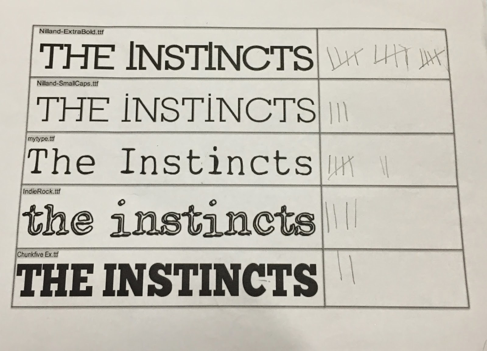
Me and Liam went on dafont together and picked out 5 different fonts which we liked and thought matched the indie rock genre that we wanted our band to be. We went around the common room, which allowed us to get opinions from the target audience which we said would listen to this indie in our audience profile. It is the same age range as the audience profile however we asked girls aswell as boys when doing the research. We thought using both genders may allow us to reach the most creative and presentable option we can. We ended up asking 31 people and 15 which is nearly half decided on the top option.
We was both happy with the response of that choice because as you can see we put two choices of the same font "Nilland" but one more narrow than the other which shows we was considering this font more than the others from the start of the research. One of the fonts called "my type" also got 7 votes. I also like this font aswell but I felt like the typewriter font was very generic and typical for the genre we are approaching. The "indierock" font also got a reasonable amount of votes (4) but we thought the font looked slightly immature and wouldn't fit the image we already have planned to go for.
The research was productive despite already having a favourite font before handing out the options. It has made not bias to our band's font as it was a clear favourite from the age range we are aiming to target. The font chosen in my option also fits the edgy and quirky song we are using for our music video.


