
Showing posts with label planning. Show all posts
Showing posts with label planning. Show all posts
Saturday, 14 March 2015
Change of roles
Due to Liam becoming the new boyfriend for our music video, that left me to direct the rest of the music video. I was anxious about this decision as I feel like being behind the camera is not my strongest point and I was not as good as Liam is. I accepted to do it nevertheless as I strongly believed that in the position we was in that Liam would be the best actor we could get in our time and knew exactly what we needed for our music video.

Friday, 13 March 2015
Change of Cast
 Due to Kameron cancelling on us numerous times and us coming closer to the deadline. Me and Liam decided to drop Kameron from the music video, the new Brian will be Liam due to the short amount of time left. I am disappointed that Kameron could not finish the music video with us because I thought that he fit the role well and he was also studying drama so he seemed passionate about what he was doing. Arguably we should have recasted sooner due to how awkward it was for all of us to meet up as Kameron was only frees at weekends, Liam worked all weekend and I was only free on the sunday.
I feel confident that Liam will play the part of the boyfriend well as he knows how the character should be and we have also watched Kameron do a good job at playing the character behind the camera. We decided using him would be the best idea as we don't want anyone else to let us down and we would not be sure on how the other person would act until we had finished filming if we recasted another person but we are running out of time to take the risk.
Saturday, 7 March 2015

Tuesday, 13 January 2015
Oxleas Woods
Before filming, me and Liam decided to look around at the location of Oxleas Wood and to tweak our storyboard so the location fits with it. We found a specific spot which would be ideal for what we need for the chase scene. We found a central part in the woods which was quite isolated from the rest of the woods so our filming would not be interrupted by local residents. This central part had other paths coming off of it which would work well for the chase scenes and would be easy to film. I feel like this location will work well and I am excited to film this specific part of the music video.
Monday, 12 January 2015
Change of location
Due to the distance of Tile Kilns Wood, we have decided it would be more practical to shoot in a location based closer to us due to the most likely need to reshoot. The commute to Tile Kilns Wood would be a struggle to do ongoing times. The new places we are taking into consideration are one bus away or a 5/10 car journey away for when we need to travel with equipment.
The first place we are considering is Oxleas Wood, this is our most local woods and it is easy to get to. This is a huge amount of land so we are going to have a look and reconsider our shots from the storyboard here first due to the amount of different locations there are here. There is also a car park in the middle of the woods. I think this place may give us the space we need that Kilns Wood has. Despite our storyboard being based on the locations there, I think it is possible that we can fit our storyboard to this location as well.
The other place we are considering is Abbey Ruins / Woods. This would be awkward for us to go due to it being slightly away from where we live and there is a tourist location part in there due the ancient monument there. There is also a nature reserve so filming may be slightly inappropriate for this location, depending on where we decide to film there.
The first place we are considering is Oxleas Wood, this is our most local woods and it is easy to get to. This is a huge amount of land so we are going to have a look and reconsider our shots from the storyboard here first due to the amount of different locations there are here. There is also a car park in the middle of the woods. I think this place may give us the space we need that Kilns Wood has. Despite our storyboard being based on the locations there, I think it is possible that we can fit our storyboard to this location as well.
The other place we are considering is Abbey Ruins / Woods. This would be awkward for us to go due to it being slightly away from where we live and there is a tourist location part in there due the ancient monument there. There is also a nature reserve so filming may be slightly inappropriate for this location, depending on where we decide to film there.
Friday, 2 January 2015
Costume


Due to my band's genre being Indie Rock and to make it easy to cast people me and Liam decided that we want our band members to dress casual and in clothes which can be found in high street shots. We had an idea for the main vocalist to wear a checked shirt as when doing my research of current indie rock bands that seems to be a convention in them all. Underneath the checked shirt I want to have a basic tee as that also seems to be a recent fashion which would grab an audience to the young males that watch the videos. I want all the band members to wear tight skinny jeans and preferably dark colours although that would depend on the types of shirts that my actor would have.
For shoes I wouldn't want my actors to wear trainers as they are contrasting to the more formal and dark coloured clothing. Ideally I would like to ask the group of boys which we ask to be in it to wear desert boots and perhaps loafers as it suggests a more indie culture whereas white trainers to me connote more of a pop image. I feel like I am not being too fussy about the appearance of the band member as when researching into the indie rock band member's clothes there doesn't seem to be a strict style other than usually checked shirts and dark clothing which is high street today.
Wednesday, 31 December 2014
Go-Pro Strap Extention
 For the chase scenes me and Liam decided to buy an extension to the school's go-pro. The extension allows us to film the actor's face without them having to hold the camera, we thought this would be ideal for the chase scenes. We thought allowing the audience to see their facial expressions will be more effective and create more suspense.
Friday, 5 December 2014
Storyboard
This is the storyboard for Brainstorm, me and Liam decided to have both narrative and studio in our music video due to the studio clips being fitting to the band's genre. The narrative is about Brain, a boy who is too big for his boots and thinks he can get away with anything. Brain hooks up with a girl in the night and finds himself in her bed the next morning, juxtaposing this the girl's boyfriend is arriving home and Brain runs past him. A chase scene begins and Brain ends up being beaten up in the middle of nowhere with no help.
Thursday, 20 November 2014
The Pitch
This is the pitch we presented to our class to receive feedback to improve our ideas and have a clear image of what our target audience would like to see or to see improved. Liam put together the powerpoint and I feel like the way it was put together settled our audience to thinking for an indie rock genre due to the use of frequent contrast of black and white which most people our age pick up on indie bands for today due to band such as The 1975. I am proud how our pitch turned out and I felt like it was presented with thought and consideration. The only aspect of our pitch I feel like we slightly neglected was the moodboard which is something we could go back to.
Wednesday, 5 November 2014
Primary research for choice of font
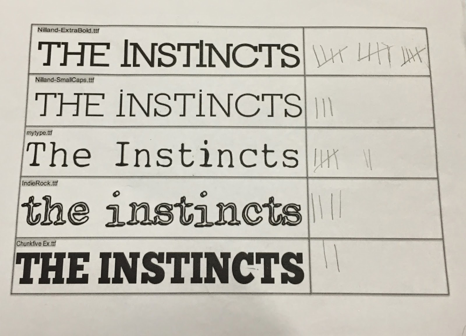
Me and Liam went on dafont together and picked out 5 different fonts which we liked and thought matched the indie rock genre that we wanted our band to be. We went around the common room, which allowed us to get opinions from the target audience which we said would listen to this indie in our audience profile. It is the same age range as the audience profile however we asked girls aswell as boys when doing the research. We thought using both genders may allow us to reach the most creative and presentable option we can. We ended up asking 31 people and 15 which is nearly half decided on the top option.
We was both happy with the response of that choice because as you can see we put two choices of the same font "Nilland" but one more narrow than the other which shows we was considering this font more than the others from the start of the research. One of the fonts called "my type" also got 7 votes. I also like this font aswell but I felt like the typewriter font was very generic and typical for the genre we are approaching. The "indierock" font also got a reasonable amount of votes (4) but we thought the font looked slightly immature and wouldn't fit the image we already have planned to go for.
The research was productive despite already having a favourite font before handing out the options. It has made not bias to our band's font as it was a clear favourite from the age range we are aiming to target. The font chosen in my option also fits the edgy and quirky song we are using for our music video.
Tuesday, 4 November 2014
Production Log #2

 For my second shoot me and Liam got other people to take photos of. As our digipaks have to be individual we are editing and using the photos differently for our digipaks. As I liked the coloured image from our first shoot more than Liam did I decided to carry on the idea of a pop art influenced images. I decided to consider these two images for the inside of the digipak, to progress to idea I want to take two new images with different boys in, I would most likely copy the colour theme using the colours red and green. The only doubt I have using a colour theme to my digipak that it doesn't fit well with the indie rock genre. I will have to make another plan of a digipak to see if I can fit in some conventions. I like how using a black wall I was able to edit the images so the background is a clear black but the image of my band members has a sense that they have importance and they are forward in the image.
I did have another boy I took images of but unfortunately it was not lined up as well as these two were. I definitely need to take two more images like this so I have a complete set of the band member's single shot. I am still unsure of what to have as the front cover of my digipak as the cover having four faces split into one was difficult and when playing around on Photoshop I believed that it looked wrong and not as effective as I would have liked it to me. I feel like this idea is more effective and looks professional but my only concern is if this idea can be fitted into the indie rock genre.
Audience Profile

After creating a band profile I decided to create a matching audience profile aswell. I decided to create an audience of young males based on the fact that the type of people who listen to the genre of music we are working on are males that are in our sixth form. The audience indie rock seems to attract is males because of the boysterous image the bands usually give. There is not many female connections with an indie rock band's image. As indie rock is a sub genre they usually have a smaller audience than other bands in the media, because of this I decided to include that this person is keen on music magazines such as NME and social media which allows us to interact and find out about new upcoming bands.
Tuesday, 28 October 2014
Testshots and Photoshop


Using our first test shot image we decided to try different effects on photoshop which would be more niche. We looked into using a 'pop art' themed front cover. Liam was not as keen on this idea so as we have to come up with different Digipaks I think I may try and develop this idea myself. The only thing I am not keen about in these images is that the logo is also been changed colour although that could easy be fixed on Photoshop. I love the posterised effect to these images and how using a black wall in the original image has made the background turn to a bold black colour when using filters.
When taking another shoot I most definitely will play around with colour again but in another style. After this shoot I will begin to start using people which will be included in our music video so the Digipak and the music video are corresponding. I am excited to continue using Photoshop and developing new ideas with it as the Digipak has a lot of different potential ideas which could be developed with the genre we are doing.
Friday, 24 October 2014
Band Profile

I used Photoshop to create a band profile using the likes, dislikes and a small brief and history of the band that me and Liam created in lesson. I added these notes onto the profile as I feel like they are essential to portray the band's attitude. I also added images at the bottom which are relevant to the band's influence. I added locations such as a pub, inside venue and a festival. I also added band influences of the Arctic Monkeys and The Libertines. Stereotypes to the indie rock audience have also been added, the outfit and style of the man and the use of vinyl.
Thursday, 23 October 2014
Production Log #1

23/10/2014 - Testshots
On Thursday me and Liam decided to get some test shots for the digipak and poster before breaking up for half term. We decided to do this because we needed black rooms/space which we thought would be difficult to find outside of school as in school we have drama production rooms and gallery rooms. We decided to go for a theme of a black background behind someone due to the influence of other indie rock bands. One example of this being done is an Arctic Monkeys cover and another album which a similar idea to it is a Kings Of Leon album cover.
We used a studio light to shine upon our band member's face, which for this testshot was Liam himself. When turning on the light we realised it was too bright for the image we was going for so out of black card we created a cover for it with a slit in the middle. The middle slit was aimed to go onto the eyes and less on other facial features. This idea unfortunately did not work but it was a good experience to try and create someone like this for future preparations.
We successfully got an image that we both liked. We took this into Photoshop and added lighting and filters onto it. I think playing around with different effects at this stage was helpful to create an idea for what we both want for our digipaks.


These are the two album cover ideas we both ended up with. The first has the lightening enhanced on it. This edit of our image reminds me of the Arctic Monkeys' album cover "Whatever People Say I Am That's What I'm Not". The similarities of both would be the central image of a person. Both give a edgy and not a friendly image which could be connoted with the genre of indie rock being quite urban. The dark colours are also an obvious similarity however I feel like the black and white would not look as good with our image like it does with Arctic Monkey's cover. We decided to add our chosen band logo to the image to see if it would look correct together. I feel like the logo could be improved by adding a box of a contrasting colour behind it like the Arctic Monkeys' one. This would make our logo more clearer which is needed as a band is being portrayed as a new upcoming band. The Arctic Monkeys' cover also doesn't contain the album name but for my digipak cover I would want to contain that as they are an upcoming band and this is their first album.
Friday, 17 October 2014
Digipak first design


We then created the digipak idea onto Photoshop. I got a template of 6 squares and recreated the drawing I made in my notepad.
- Top left: Inside left
- Top middle: Centre
- Top right: Inside right
- Bottom left: the right/left fold
- Bottom middle: Back cover
- Bottom right: Front Cover
I realised once finishing that I have positioned the plan awkwardly on Photoshop. Since doing it on photoshop me and Liam decided to change the front cover to a split image of the four band members on one face / body similar to the Kings Of Leon - Only by the night. I used images of silhouettes to show the positioning of images once we have them as this is only a plan. On the back cover I left the text box empty which is meant to contain the track list as I wanted to show the image behind the box was one of the four band members.
Monday, 13 October 2014
Genre which I want to use
 |
| Click to enlarge |
After deciding that I would like to do work based on the indie rock sub genre. I created a brainstorm of bands which are in that specific genre and the stereotypes I have picked out of that sub genre. I picked out the stereotypes by looking at 3 images of band members. The bands that I used to analyse appearances were: Drowners, Arctic Monkeys and The Kooks.
Drowners have a urban and street image of themselves as they have the rock conventions of skinny jeans and messy hair but they also are wearing snapbacks and panels. Their photo shoot was also took behind a vandalised wall. Arctic Monkey's image is more tidier, the lead singer Alex Turner has greased back hair and wears braces with a leather jacket. It could be argued that Arctic Monkey's image is influenced by classic rock and they wear more vintage smart style clothes in comparison to the 'messy' look. The Kooks' image was very metrosexual, the band members were wearing very feminine clothing but however are all straight men. They wear low cut tops and bowler hats which was unusual and I had never personally seen before in the indie rock scene. However they still had some of the classic conventions.
All bands had a lead male singer and were shown to play their own music. They all also have the same clothing image slightly as they all appeared to wear skinny jeans and darker choices of clothing rather than bright colours. In each band there one or more man with messy hair and stubble which seems to be an edgy and stereotypical look in recent rock.
Genre Brainstorm
 |
| Click to enlarge |
In lesson we was asked to break down the different types of genre. What have I learnt is that there seems to be more sub genres of rock than there is of anything else. This may be because I know the most about that genre but others in the class who are not known to listen to rock seemed to have known the same sub genres that I listed. There are different styles of rock and rock has been around for a long time which may be why the rock genre has more sub genres from the others.
The other genre which seemed to have a few sub genres was dance music. This is interesting as I would think that dance music is the most recent genre out of the ones I have brainstormed. Dubstep is also very recent. Dance music could be argued to be the most popular genre of music in society at the moment. The stereotypical thought of dance music is the music we hear in clubs, however we now hear these sub genres of music on the radio.
Friday, 3 October 2014
Looking into band logos


We decided to look into band logos before creating our own one. We decided to look at four different band logos from a similar genre to what we are doing. From doing this we gathered that most indie rock / alternative rock bands usually have a logo which is black and white. The Libertines and Drowners logos have a sans serif font which is bold and blunt and stands out. However, Arctic Monkeys' and Kings Of Leon's logo contain serif font as it is more wavy and decorative. The serif fonts in my opinion are easier to remember the band's logo than the other two. I think sans serif stands out less as both band's logos containing that have an image or background with the font which has been chosen. For our band we decided we would prefer a serif font as it is generally more eye catching. When doing our research for logo font ideas we will also include sans serif fonts aswell to see what our audience would prefer.
Subscribe to:
Posts (Atom)